Brand identity design
Creating unforgettable brands through bespoke logos, hand-lettering, and punchy illustrations

Brand identity design packed with personality and powerful storytelling.
I design illustration-led brand identities that give clarity and character to organisations – especially those selling ideas, services or learning experiences. Whether it’s a course, a community or a charity service, I turn abstract or (sometimes!) uninspiring topics into visuals that feel engaging, human and easy to connect with.

The Fractional Hub
As head of creative and marketing for The Fractional Hub (a start-up business aimed at educating and connecting people starting their fractional careers), I designed everything visual for the company, from the logo, brand guidelines, brand illustrations, full website design and build, marketing campaigns for email and social media, course branding and illustrations and even developed the tone of voice and marketing strategy.


Click arrows to view more >>


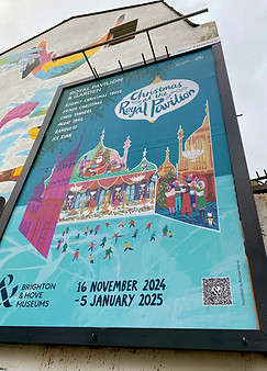
Moving Parts Arts
Creating the brand identity for Moving Parts Arts has been an evolving collaboration. It began with a commission for gothic-style brand illustrations, which led to designing their logo, then full festival campaigns and brochures. Over time I developed their complete visual identity – including a custom typeface – and went on to design and build their full website in Wix. Founded in 2017, Moving Parts Arts is an award-winning arts and community development charity. It engages 20,000 people each year through its popular week-long puppet festival and various participatory community events.


Click arrows to view more >>
Beverley Puppet Festival
The rebrand for Beverley Puppet Festival was also an evolving process. I was first brought in to design the brochures and posters for the puppet festival. I did this two festivals in a row, (the second being an online festival that adapted to the pandemic in April 2020) and for the second festival, since the COVID pandemic had hit and all live shows had to be cancelled, in order to save the festival and the artists involved, BPF 2020 adapted to hosting online puppetry workshops instead. Naturally they had no imagery for this and asked me to create an illustration to promote the festival online and also for letterbox brochures that would showcase the online factor, the workshops, the fact it was puppetry and also the year's theme of 'in nature'... quite the brief! I built a mini puppet theatre from cardboard and paper and painted and cut out all of the details. Off the back of this, BPF wanted to change their logo to the collaged/painted version that was on the puppet theatre I created, and the following year they got me to totally redesign and build their website, while creating new brand guidelines utilising the colour palette already assigned in the logo. BPF love the hand-crafted feel, since most puppeteers create the puppets and sets themselves, and so this is reflected in their brand; with hand lettering, wobbly container boxes and printed textures.


Click arrows to view more >>

Survive, North Yorkshire
Survive are a charity based in North Yorkshire, helping adult survivors of sexual violence through specialist trauma-informed services. Survive asked me to redesign their logo for them, keeping a tree and focussed around the idea of nurturing and growth. A few years later they commissioned me to redesign their full brand, design posters, leaflets and create templates for documents and presentations as well as design a full brand guide.


Click arrows to view more >>


Like to work together?
Get in touch.
Email me at hello@rachaelhorner.co.uk
WhatsApp me on +44 (0) 7769 587763